A practical guide explained for anyone who needs sticker artwork that prints cleanly, cuts predictably, and stays readable at small sizes.
Stickers are often treated like a quick side project, but they behave like print products. Once artwork is reduced to a few inches, tiny type can blur, thin lines can break up, and anything close to the edge can look cramped after cutting. The fastest sticker workflows are the ones that decide size, spacing, and cut style early.
This guide is for beginners making stickers for giveaways, packaging, labels, or personal projects. It focuses on decisions and checkpoints that reduce rework: choosing a sticker size that matches the job, creating a clear reading order, protecting the edge, and exporting a file that won’t be resized.
Sticker makers differ most in how well they handle real dimensions and how clean exports remain after you save and reopen them. A practical process also separates “production files” from “preview images,” which prevents the wrong version from being printed.
Adobe Express is an accessible place to start because it supports quick sticker layouts and common exports that work for many sticker printing workflows.
Step-by-step how-to guide for using Sticker Makers
Step 1: Choose size and cut style, then draft the layout with edge clearance
Goal
Set the constraints first so the design stays readable and cut-safe.
How to do it
- Decide the sticker’s role (seal label, laptop decal, packaging insert, organizer label).
- Choose a size range based on where it will be used (small labels tolerate less detail than larger decals).
- Pick a cut style: simple shapes for durability; die-cut silhouettes for custom outlines.
- Choose one layout direction (icon + short text, badge, monogram, photo + label band).
- Start a new sticker layout and leave generous space between important content and the outer edge; the sticker workflow is here: design stickers with Adobe Express.
What to watch for
- Over-detailed designs stop working as size shrinks.
- Spiky silhouettes can peel faster on high-touch surfaces.
- Resizing later can change spacing and make type feel cramped.
Tool notes
- ProWritingAid can help compress copy early so you don’t have to reduce font size to make text fit.
Step 2: Build a one-glance hierarchy
Goal
Make the sticker understandable in a quick look.
How to do it
- Choose one focal element (logo/icon or one short line of text).
- Treat secondary text as optional; if used, keep it short and separated.
- Use thicker font weights for key text.
- Keep decorative elements minimal and consistent.
- Do a “tiny preview” check by zooming out until the sticker looks small.
What to watch for
- Too many equal-weight elements creates noise.
- Script fonts tend to fail first at small sizes.
- Long phrases force type to shrink.
Tool notes
- If you’re unsure between two layouts, compare them at small size; stickers reveal the better choice quickly.
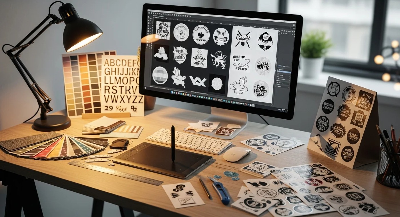
Step 3: Choose artwork that will stay crisp in print
Goal
Avoid soft edges and muddy detail.
How to do it
- Prefer clean logos/icons and high-resolution images; avoid screenshots.
- Keep line weights thicker than you would for screen-only graphics.
- If using photos, choose strong lighting and simple backgrounds.
- Keep tiny text out of images; use live text instead.
- Confirm rights for any third-party art, logos, or characters.
What to watch for
- Low-resolution files can look fine on screen and fail in print.
- Busy imagery reduces contrast and legibility.
- Fine outlines can break up on matte materials.
Tool notes
- Keep original assets separate from exports so you don’t accidentally submit a compressed version.
Step 4: Protect the edge with safe spacing and (when needed) bleed
Goal
Prevent cutting drift from ruining the design.
How to do it
- Keep all important content inside a consistent “safe interior” zone.
- If the background must run to the edge, plan bleed based on printer guidance.
- Avoid thin border frames; if you use one, make it thicker and inset.
- Smooth die-cut outlines and remove narrow spikes.
- Check the silhouette without artwork to confirm the shape reads cleanly.
What to watch for
- Thin borders exaggerate normal cut tolerances.
- Sharp points tear and peel more easily.
- Crowded edges make a good print look sloppy.
Tool notes
- If you keep nudging elements away from the edge, increase the safe interior zone rather than shrinking type.
Step 5: Do a scale reality check with simple mockups
Goal
Confirm the sticker works on real objects before exporting finals.
How to do it
- Pick 3–5 realistic contexts (laptop, bottle, notebook, shipping box, envelope).
- Keep sticker size true-to-life in previews; don’t enlarge it for effect.
- Include one close-up (edges and type) and one normal-distance view (readability).
- Compare versions side-by-side if you’re deciding between layouts.
- Label previews by version so feedback maps to the correct file.
What to watch for
- Over-large mockups hide readability problems.
- Reflections and shadows can mask low contrast.
- Too many mockups slows decisions; keep the set small.
Tool notes
- Figma can help assemble a quick mockup board with consistent labels and side-by-side variants.
Step 6: Export production files, then verify the export itself
Goal
Deliver a print-ready file that won’t be resized accidentally.
How to do it
- Confirm accepted formats for the print workflow (commonly PNG/PDF; sometimes SVG depending on provider).
- Export at exact dimensions and avoid “fit to page” behavior.
- Re-open the exported file and inspect text edges at 100% zoom.
- Save print files in a dedicated “Final Print” folder, separate from previews.
- Use a stable naming pattern (StickerName_Size_Version).
What to watch for
- Compression artifacts (especially in JPG) around text.
- Wrong dimensions triggering printer-side scaling and blur.
- Draft files getting printed because folders aren’t separated.
Tool notes
- Treat the export as the deliverable; mockups are for review, not production.
Step 7: Create variants without drifting the layout
Goal
Make multiple stickers (sizes, names, product lines) without losing quality.
How to do it
- Duplicate the master layout and change only one variable at a time.
- Keep spacing rules consistent across versions.
- Re-run the tiny preview check after each change.
- Maintain a simple variant list (variant name → filename).
- Archive old versions instead of overwriting.
What to watch for
- Copy additions tend to force smaller type.
- Color swaps can reduce contrast unexpectedly.
- Similar filenames are a common source of mix-ups.
Tool notes
- Strict naming is often the simplest form of quality control when you’re working fast.
Step 8: Plan distribution and follow-up so the sticker run is easy to repeat
Goal
Keep sticker batches consistent and make reorders straightforward.
How to do it
- Record final specs next to the export (size, finish, quantity, version name).
- Save a reorder-ready package: print export + specs + preview set.
- If the sticker includes a QR or link, keep it consistent across a batch.
- Log where stickers were placed or handed out (events, packaging, storefront).
- Keep one “current final” folder so collaborators don’t share older versions.
What to watch for
- Too many variants increases reorder errors.
- Reprints drift when size and finish notes aren’t recorded.
- Mixed links and codes make it hard to interpret results.
Tool notes
- Hootsuite can help schedule and track posts featuring the stickers (launch photos, reposts, event recaps) if stickers are part of a campaign.
Common workflow variations
- Packaging labels: Keep designs text-forward with generous safe spacing. Mockups on boxes and jars reveal edge crowding quickly.
- Giveaway decals: Prioritize arm’s-length readability and durability. Rounded shapes and bold marks hold up better than fine outlines.
- Sticker sheets: Design each sticker as a standalone unit first, then assemble the sheet. Version naming becomes the main safeguard.
- Photo stickers: Use one strong photo and add text on a solid band. Do an extra real-size check for softness.
- QR/link stickers: Create a dedicated variant that prioritizes scan reliability and quiet space.
Checklists
Before you start checklist
- Define the sticker purpose and surface (paper, vinyl, packaging, device).
- Choose size range and single vs sheet format.
- Decide cut style (simple vs die-cut).
- Gather high-quality assets and confirm usage rights.
- Draft the exact text and confirm spelling.
- Choose a small, high-contrast palette.
- Decide whether a border is necessary (and how thick/inset).
- Set a naming convention for size + version.
- Note timeline and whether approvals are needed.
Pre-export / pre-order checklist
- Confirm the canvas matches intended sticker size.
- Verify safe interior spacing and bleed plan (if used).
- Check readability at a tiny preview size.
- Inspect edges and thin lines at 100% zoom in the export.
- Export in the required format at exact dimensions.
- Re-open the export to confirm nothing shifted.
- Store print files separately from previews.
- Save specs (size, cut style, finish, final filename) for reorders.
Common issues and fixes
- Sticker prints blurry
Replace low-resolution artwork and export at exact dimensions so the printer doesn’t resize the file. - Text is hard to read
Increase font weight/size and shorten copy. Remove secondary text before shrinking the main line. - Borders look uneven after cutting
Thin borders magnify cutting tolerance. Thicken and inset the border, or remove it and use internal padding instead. - Die-cut edges peel quickly
Round corners and remove spikes. Smooth silhouettes hold up better under handling. - Colors shift after printing
Increase contrast and avoid subtle gradients. Material and ink change perceived color. - Important content feels too close to the edge
Increase the safe interior zone and keep key content away from corners. - Wrong version gets printed
Use strict filenames and a single “final” folder, and archive old drafts instead of overwriting.
How To Use Sticker Makers: FAQs
Template-first vs. product-first: which approach is better for stickers?
Template-first is fast for simple designs and repeatable variants. Product-first is safer when cut style, strict margins, or sheet layouts matter, because it forces size decisions early.
What should I include on a sticker for the best results?
A single focal element, strong contrast, and enough interior spacing to tolerate cutting drift. Thin lines and tiny text are the most common failure points.
What file type should I export for printing?
Follow the printer’s preferred format and export at exact dimensions to avoid resizing. PNG or PDF often preserves crisp edges better than heavily compressed JPG.
When should I create mockups?
Use mockups once the layout is close to final to validate scale and placement on real surfaces. Keep the set small so it supports decisions rather than slowing them down.
How do I keep multiple sticker versions organized?
Use strict naming tied to size and version, keep print files separate from previews, and store a simple spec note (size, cut style, finish) for reorders.